As a digital growth agency for the Financial Services industry, we get a lot of requests for website rebuilds, redesigns and CMS migrations. Many companies are looking to modernise their websites and overhaul legacy CMS solutions. In this blog post, we outline how we revamped the website of a leading trading software provider, Tradeguider, with HubSpot CMS.
Challenge: Modernise the website and transform the user journey
So, let's outline the challenges that we looked to solve with the website redesign project...
What does Tradeguider do and how did they approach us?
Tradeguider is a global trading software provider and educator, helping traders of all types to save time on chart analysis and get a better perspective on the markets, thanks to their unique trading methodology and semi-automated system.
They reached out to us wanting to revamp their old website and combine several sub-brands and domains into one consolidated offering.
What were the client’s key challenges?
Tradeguider's website was outdated and no longer fit for purpose. Their CMS was custom-built and legacy and the maintenance on the old front-end system was time-consuming. The CMS required a lot of maintenance, wasn’t flexible and was counter-intuitive for both editors and marketers.
Three different product offerings were spread out across different websites and visitors had to jump from one website to another, while browsing different pages and products, to find the right solution for their needs.
The main website's structure was confusing for the end user and the dated design was impacting credibility, which is crucial in the trading space. Tradeguider had the trust factors, but they weren't showcased on the site.
The friction in the website user experience was resulting in poor conversion rates and high bounce rates. The company also required greater insights into website behaviours and better reporting, to enable effective segmentation and nurturing of the database and strategic campaigns for upsells, renewals or retargeting.
Solution: HubSpot CMS and an inbound marketing strategy
We embarked on custom rebuild exercise for the Tradeguider website. We looked at current behaviours, assessed the customer journey and understood the personas. Using HubSpot CMS Pro, we developed a website using a GDD (growth-driven design) approach that touches on all aspects of the HubSpot flywheel model and caters for all the lifecycle stages. And we employed UX and UI methods to meet expectations in our client’s industry.
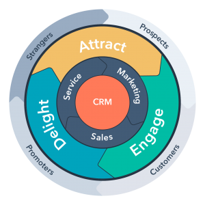
We had already introduced the HubSpot Marketing, Sales and Service Hubs to the client, and they were excited about HubSpot's potential. Particularly, how it would help them to unify data, reduce their tech stack and have one source of truth, and enable them to implement a multi-channel approach to lead generation and customer retention.
Key focuses of the website project
The main focuses of the project were on modernising its look and feel and transforming the user journey to make it easy for visitors to navigate, take further actions and get useful information for more informed browsing and buying decisions. Plus, we wanted the site to be a trusted source of insights and educational content for leads and existing customers.
A new CI, new messaging and SEO-mapped content for each page was developed to meet each persona’s expectations and solve their pain points throughout the user journey.
We needed to integrate HubSpot CMS with Tradeguider’s ecommerce system and the website’s products required high-quality descriptions, persuasive copywriting and support from visuals, including product demos and explainer videos. Related product data had to meet expectations and supporting content had to establish Tradeguider as industry experts (and their products as cutting-edge).
The importance of website user experience
Improving the website user experience was an important part of the project and understanding the buyer personas was critical. We carried out extensive audience and keyword research and underpinned everything with user journey mapping to create a persona-focused content strategy and user experience.
The objective was to help visitors discover and learn more about the products and their benefits, enjoy useful and exclusive content and be nurtured throughout their journey - starting as visitors and ending up as promoters for the brand - which is very important in such a tight niche. The new content and site architecture embraced the inbound methodology, encouraging conversions and delighting visitors through a unified experience.
Implementing an inbound methodology and strategic content plan
We created a content plan to deliver regular and relevant posts for the client's brand new blog, for different buyer’s journey stages and personas. We also created keyword-rich landing pages, content offers for lead capture and email marketing campaigns and workflows to promote regular live trading sessions, webinars and online workshops.
Tradeguider already had a wealth of long-form trading content, including ebooks, courses and live chart analysis videos, for people to purchase or access through subscriptions. We had to package this in the right way, whilst creating new gated content offers, such as a free guide (Capitalising on the Market Trends by Implementing a Wyckoff VSA Strategy). This headline content offer will be used across organic and paid strategies to attract and nurture personas.
The main goals for the first 2 months after the website launch were to:
- Enable users to buy directly from the website, without being guided by a salesperson
- Get at least 20 demos booked per month
- Increase website traffic by 5% MoM
Results: what we achieved for our client
The website: Then and now
Here’s a summary of the old website’s key issues:
- Minimal options on the main navigation - not an easy path for visitors to find helpful information
- No company blog or news section
- No About Us page
- Basic-looking visuals
- Not user-friendly or visually-engaging
- Inefficient use of space - CTAs and content blocks felt cluttered
- Design elements and look and feel was old-fashioned
- CRO not fully implemented or effective
- Messaging too direct/salesy
- Fragmented user journey, redirects to other websites, including product pages on sister sites
Take a look at these screengrabs of the old website:


Here’s a list of what we implemented through the project:
- Approached the project from a GDD perspective
- Made use of video content on key pages
- Mapped keywords to website pages and created new standalone pages
- Pain point-based messaging
- Educational tone to visuals and copy
- Created new revenue streams targeted to different personas
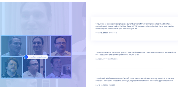
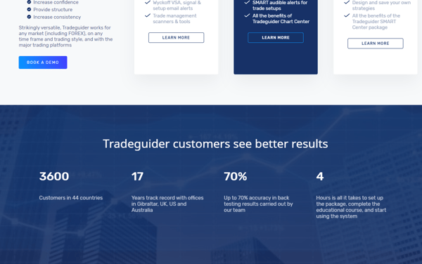
- Made use of trust elements such as the About Us page, testimonials, persuasive copywriting, CTAs and other trust signals (including integrations available)
- Incorporated all products and services on one website (pulling and segmenting all the relevant information from four websites)
- Created a clear product pricing and detailed outlines of the features/benefits for each product/service
- Good balance of copy, visuals, bullets, headers/subheaders, videos and CTAs
- Used the inbound methodology to lead personas to different content based on their needs, lifecycle stage and place in the buyer’s journey
- Introduced a company blog and created posts ahead of launch
- Created a clear navigation path in the main nav, dropdowns and throughout the site
- Created plan to overhaul existing FAQs into an intuitive knowledge base (currently being developed)
- Built out supporting services into subpages for better UX and SEO impact
- Put an emphasis on Tradeguider’s unique methodology across the site
Here are some snapshots of the new site:
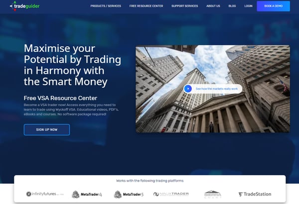
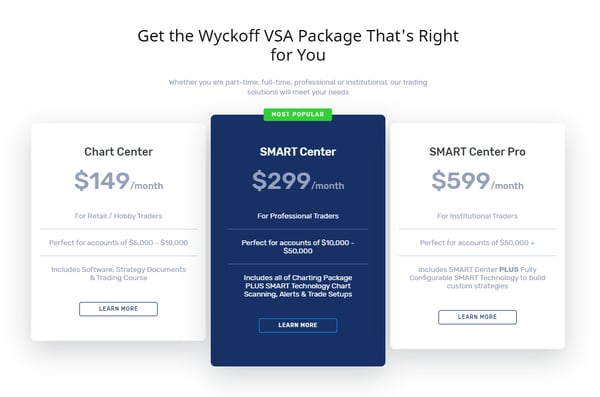
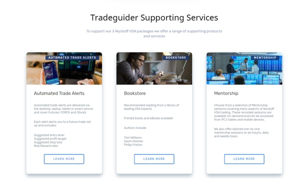
For an in-depth look at how we transformed the website user experience, Inbound FinTech CEO Sheila Mitham walks you through the project on the video below:
Successes post-launch:
Based on the main goals for the first 2 months we have achieved:
-
- Healthy amounts of purchases over the website with no sales support have been made for the first time (the benchmark was 0, as per the previous website)
- 46 product demos booked (the goal was of 20 demos)
- Increased website traffic by 7% MoM (the goal was 5%)
Results have been impressive since the launch of the new website. In fact, just days after the new website went live Tradeguider got one of the biggest outright online purchases from its product pages.
We introduced the customer database to the new site through email marketing and the new pages, blog posts and marketing activity have boosted traffic and conversions. Bounce rate has been reduced and we’ve driven leads through content offers and email campaigns. More recently, we’ve kickstarted social and paid social campaigns and driven revenue via product purchases, resource downloads and subscriptions, and trading packages.
Given that historical data was only partially available, we will outline some specific results achieved since the implementation:
Overall website traffic & traffic sources results:
- Even though the new website was only recently launched, we're already seeing a very good and sustainable MoM increase in website sessions, with a 7% increase in June alone, compared to May.
- Key traffic sources like Organic and Direct are already bringing in customers, compared to the previous website, which did not directly convert traffic into customers.
![Sessions by source on new Tradeguider website [chart] | HubSpot CMS](https://blog.inboundfintech.com/hs-fs/hubfs/blog-images/sessions-by-source-hubspot-cms-build-tradeguider.png?width=840&name=sessions-by-source-hubspot-cms-build-tradeguider.png)

SEO Results:
We've improved the average position since the new website launch.
We've increased the visibility trend since the new website launch.

Impact: Better website user experience and an intuitive user journey
Through our GDD approach, we’ve realised Tradeguider’s vision of the website build and surpassed their expectations around the potential of HubSpot CMS. We enhanced the website user experience and the CMS build has enabled the client to make stronger connections with its customers. We streamlined processes by introducing automation and the new website structure and user journey help visitors find the information they need. The site employs CRO tactics and smart content to convert more opportunities.
The new website user experience will help Tradeguider gain a competitive edge in an evolving digital economy, educate and empower visitors and clients alike, and establish the brand as a trusted source of insights for traders.
Thoughts from the client on the website redesign
Take a look at this video, featuring Tradeguider CMO, Richard Bednall, speaking about the impact of the website redesign, HubSpot CMS and his experience working with Inbound FinTech.
Looking ahead: Continuous improvement and learnings
HubSpot CMS, combined with the tools available in the Sales, Marketing and Service Hub, will help our client make the most of existing resources and new inbound marketing content to inform, educate and guide leads and customers, deepening their relationship with the Tradeguider brand.
We plan to continuously improve and optimise the website user experience, based on insights via HubSpot’s analytical tools. Plus, we’ll launch the new knowledge base to better address trader questions and roll out localisation, advanced support capabilities and compelling inbound content. Have a browse of the new Tradeguider website.
Want to discuss a potential website project?
Is your CMS no longer fit for purpose? Do your website metrics suggest issues with navigation and user experience?
We can map out an effective user journey and create a website design with the right navigational quality to guide visitors to the content and services most relevant to them. Browse our website development services page to see what we can do for you.
If you’d like to discuss a website development or redesign project with us or explore the benefits of HubSpot CMS, you can book a meeting with our team of experts.
Inbound FinTech is a multi-award-winning Elite HubSpot Partner Agency, based in London, specialising in the Financial Services and FinTech sectors. We offer a range of services, from website development and CMS migrations, to content creation, sales enablement and PPC campaign management. Our team of digital experts help companies of all sizes to grow their business, drive high-quality leads and optimise their pipeline.


%20(3).png)


.png)


-1.png)


